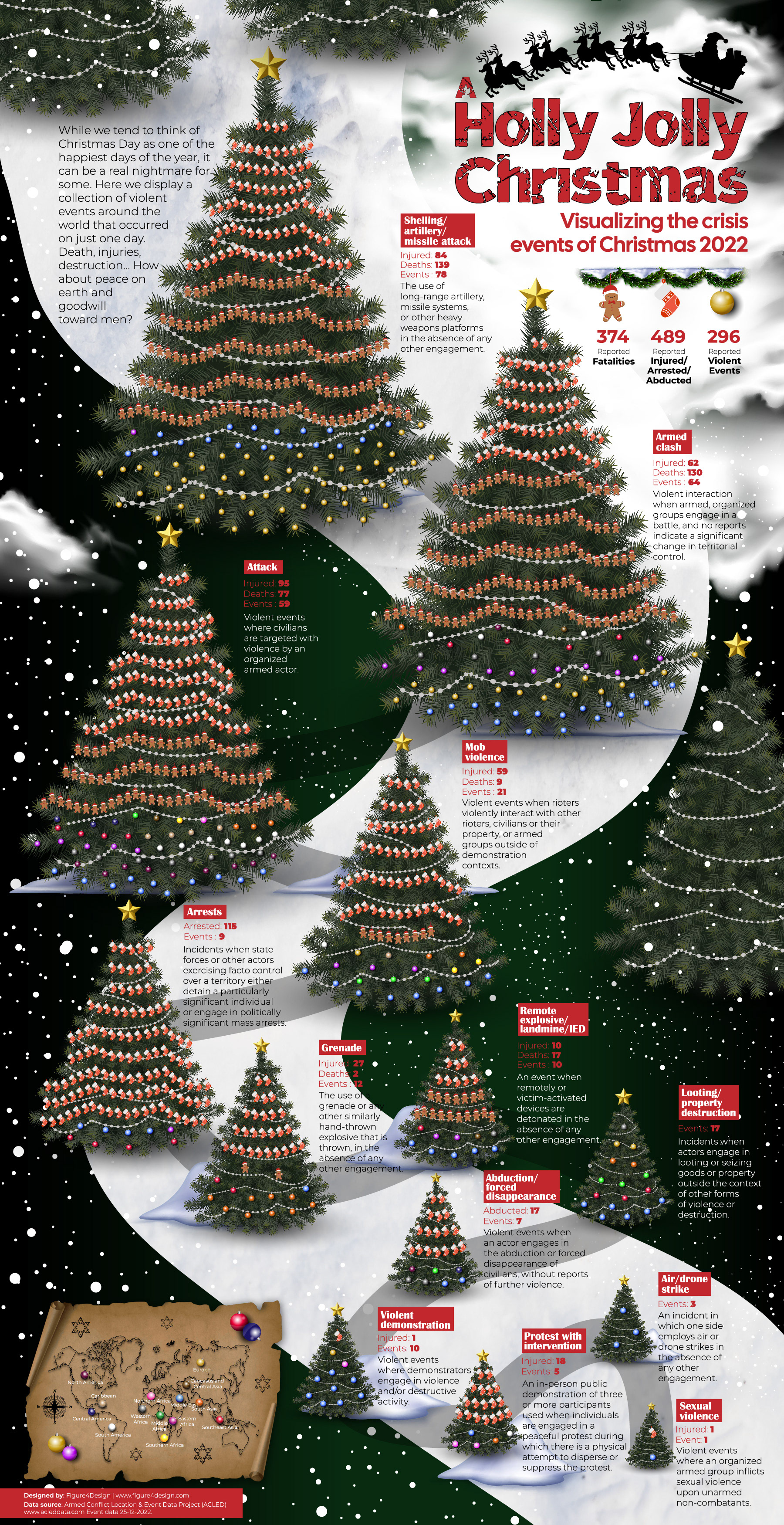
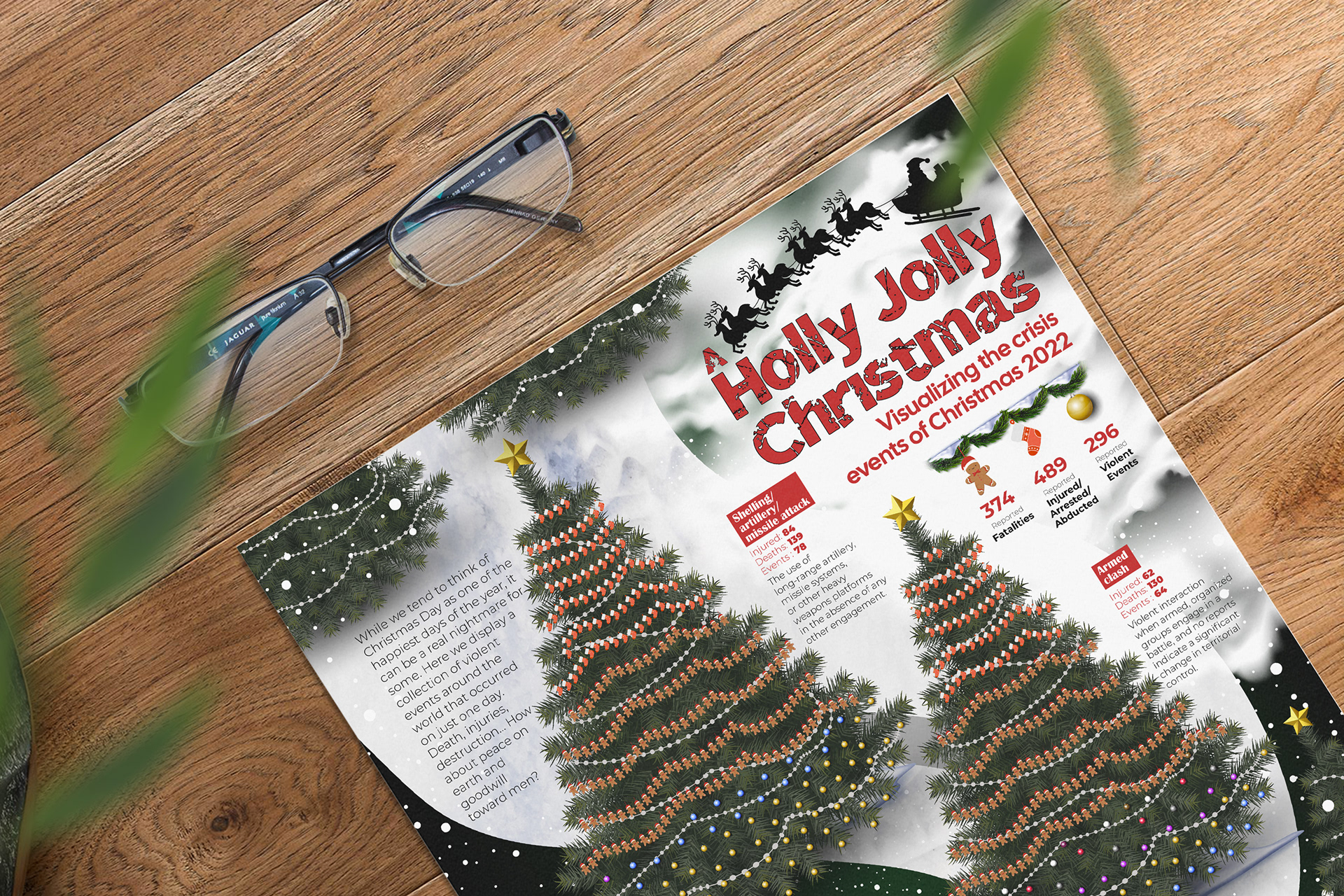
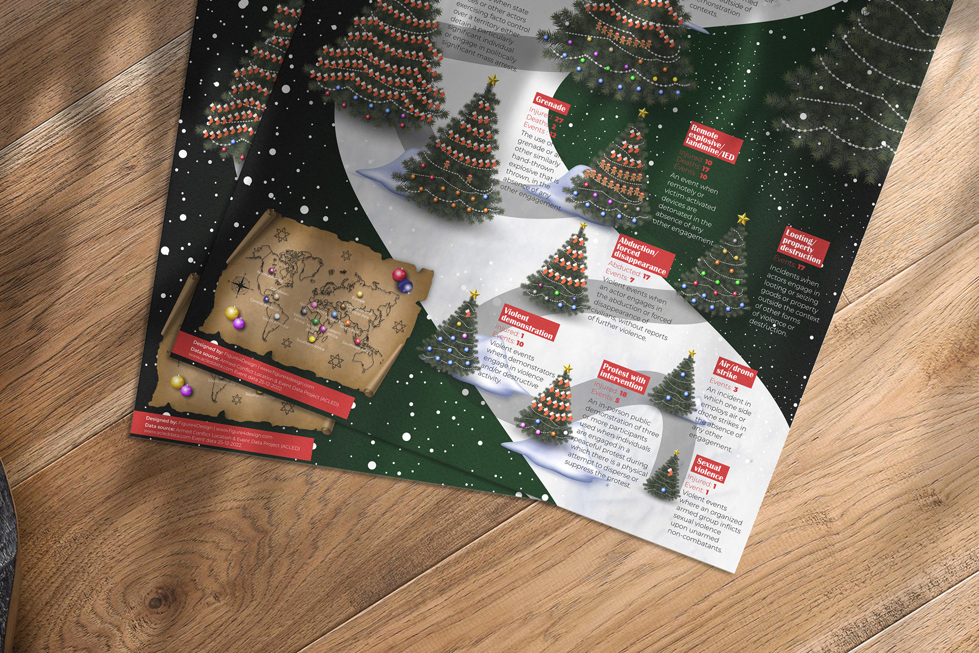
A Holly Jolly Christmas : Visualizing the crisis events of Christmas 2022
Design Role and Project Overview
In the creation of the Holly Jolly Christmas infographic for the Information is Beautiful Design Competition, I took on the role of conceptualization and design. This project aimed to visually depict the occurrence of violent events on a single day, December 2022, using Christmas illustrations and symbolism.
Approach and Key Features
Given the infographic's ironic theme, I opted to utilize holiday illustrations to convey the stark contrast between the festive season and the grim reality of violence worldwide. Through a wintry forest setting, Christmas trees were adorned with decorations representing both the victims and the regions affected by violent events, offering a poignant visual narrative.
Impact or Results
Although the infographic did not secure victory in the competition, it garnered attention from both my personal and professional circles for its creativity and distinctive approach to presenting data. The project served as a testament to the power of design in sparking meaningful conversations and eliciting emotional responses.
Holding on to Power: A visual exploration of current African leaders extending their tenure

Design Role and Project Overview
For the "Holding on to Power" infographic created for VisionAfrique, my role was to conceptualize the design and execute its visual elements. This project aimed to shed light on the phenomenon of leaders extending their rule beyond constitutional limits in African countries.
Approach and Key Features
Given the sensitive nature of the topic, I approached the design with a focus on clarity and impact. Utilizing a timeline format, I visually depicted the tenure of various African leaders and highlighted instances where presidential term limits were altered or circumvented. Key features include color-coded lines representing modified terms limits and presidential images for enhanced engagement.
Impact or Results
The infographic received positive feedback from the Africa Center for Strategic studies team, who expressed admiration for its clarity and effectiveness in conveying complex information. It sparked discussions within the team and was shared during their weekly meeting, indicating its success in capturing attention and stimulating dialogue on the issue of political power dynamics in Africa.
Mapping of African Maternal Mortality Rate in 2020

Design Role and Project Overview
In this project, I spearheaded the design and development of the African Maternal Mortality Map, a pivotal component of the "8 Challenges of the African Women" series for the VisionAfrique blog. The primary objective was to visualize the maternal mortality rates across Africa, shedding light on a critical issue impacting women's health and well-being.
Approach and Key Features
To effectively convey the maternal mortality data, I employed a strategic approach that emphasized clarity and visual impact. Key features of the map include:
- Representation of maternal mortality rates through a color-coded legend, categorizing pregnant women by the severity of mortality rates.
-Integration of geographical data to accurately depict variations in mortality rates across different regions of Africa.
- Seamless incorporation of the map's branding into the broader series on African women's challenges, ensuring alignment with the overarching narrative and thematic focus.
Impact and Results
This map served as the inaugural installment in a series of visuals dedicated to highlighting the multifaceted challenges faced by African women. Its successful reception underscored its effectiveness in raising awareness and fostering dialogue on pressing issues affecting women's health and rights.
Other notable data visualizations